Monday, 30 November 2015

Learning a little about composition.

Yes. I know ... this is very basic stuff, but as someone who normally just 'wings it' as far as how I lay out my pieces this is still an area I need to learn to explore. Doing a bit of random googling I came across this webpage. I think this page mainly had photography in mind, but the same principles apply to all aspects of art and design.

https://fstoppers.com/architecture/ultimate-guide-composition-part-one-just-say-nokeh-31359

(huge copy/paste from the website)

Center Composition
Let’s begin with the most obvious type of composition – center composition. If one were to hand a camera to an aunt, and ask her to take a picture, she would most likely photograph the subject in the center of the frame. Center composition places the important thing in the middle. When it’s done well, it excels in the use of symmetry. Center composition is like roasting a chicken. It’s easy to do, but it’s hard to do really well.

Center compositions can be broken down even farther than the overall objects and can use the position of things like facial features to actually indicate the next rule…
Rule of Thirds
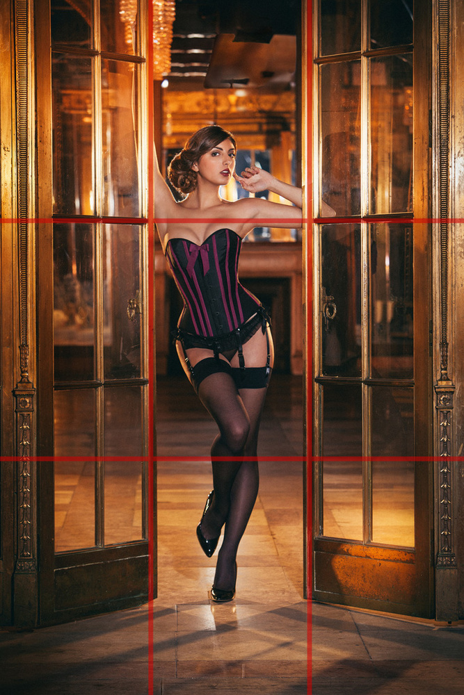
Once we learn a thing or two about composition, we start to use this. This is the first of the photographer’s “Golden Rules.” The Rule of Thirds says that an image should be divided into nine equal parts by two evenly spaced vertical and two evenly spaced horizontal lines. Important compositional elements should be along these lines or at intersections. These intersections are called “eyes.” A person’s closest eye to the camera should be placed at one of these intersections.

Using an off-center composition creates more tension and visual interest than a typical center composition would. These compositions can be basic with only one subject….

…or they can be much more complex, using multiple intersections and lines to draw the viewers eyes around the image.

Golden Triangles
This rule works by having strong diagonal lines pass through the image, dividing it into three (or four) triangles. The strongest line (called a major line) divides and dominates the image diagonally. Then, from one corner, an intersecting line connects to the diagonal line perpendicularly (this is called a reciprocal line).
In some cases, a third line extends from the opposite corner creating another reciprocal line.

The resulting triangles all have the same ratios – also know as golden (explained much more in depth below). This works really well on images with perspective or strong architectural elements, but it also works well when wanting the subject to fill the entire frame. Putting elements of composition on a diagonal plane gives them a more dynamic presence.
The Diagonals (Baroque and Sinister Diagonals)
One of the best things a photographer can do is study paintings and art history. Beyond the study of light, color palettes, color theory and the fact that it was the dominant visual medium for tens of thousands of years, studying great painters is the key to expert composition. When everything in a scene must be methodically arranged and obsessed over and placed just so in the frame, we are able to begin to understand why things are placed how they are. One of the more common compositions in art (do in large part to the boom of this style during the Baroque period) is using diagonal lines.
There are two predominant kinds of diagonals – “Baroque” and “Sinister”. Baroque Diagonals are read from left to right and Sinister Diagonals are read from right to left. One can only assume that this is an allusion to the notion that lefties burn in hell. In an amazing read by Adam Marelli, he breaks down the work of Alfred Eisenstaedt by using this “Sinister” composition of ballerinas.
We notice the ballerina on the left (her face is at the eye and the only face visible – therefore she is the subject), looking to the right, drawing our eye in that direction across the image, creating the diagonal, and lining up with other important compositional elements (like the pointed toe). Read a much more comprehensive breakdown of Eisenstaedt’s work on Adam Marelli’s blog.
Golden Ratio / Golden Rectangles / Golden Spiral
Classic thinkers from Plato to Pythagoras to Kepler believed that geometry is a powerful underpinning of the cosmos. Plato supposedly even said, “God geometricizes continually.” Leonardo da Vinci had an obsession with proportions – creating large areas of his work around the exact proportions of the Golden Ratio. So did Salvador Dali. As this particular rule of composition is a little complex, let’s break it down.
-The Golden Ratio describes an aesthetically pleasing proportion where the largest shape is divided by a perfect square, and the resulting rectangle is in exact proportion to the original one – all the way down the drain. This, subsequently, results in a sort of spiral (more on that below).
-The Golden Ratio is best explained using the Fibonacci Sequence (0, 1, 1, 2, 3, 5, 8, 13, …) where each number is the sum of the previous two. The actual formula for the ratio is:
Algebraically, this is shown as:
This results in the number 1.618 (approximately). This is like rounding Pi to 3.14, but this number is called Phi. Using this number helps to illustrate the ratio.
Imagine this rectangle has a width of 1 and length of 1.618. When we divide this up using the Golden Ratio, the result is that every square would have a 1:1 ratio and the leftover rectangle would always be 1:1.618. This method isn’t limited to rectangles and squares though. It also works on circles, triangles, pyramids and various other geometric forms. Theothiuacan (the pyramids of Mexico) as well as the Great Pyramids of Egypt both use the Golden Ratio. Stonehenge, Angkor Wat in Cambodia, the Temples of Baalbek, the Parthenon, the Great Mosque of Kairouan, Notre Dame and the Mona Lisa, all use the ratio. It’s found in the human body, in seashells, in hurricanes. Obviously, the Golden Ratio is pretty important. That’s because it’s EVERYWHERE.

When we draw a curve along the outer edge of the perfect square’s intersection, we are given the golden spiral. It’s simply an easier way to illustrate the Golden Ratio in a more fluid way.
To me as someone who knows NOTHING about math, I don't really understand the algebra and that, but visually I understand how the ratios work and that's important. I will have to have some arty exploration with these!

Sunday, 29 November 2015

The inspiration behind my ideas.

I haven't really posted about the inspirations that are guiding me throughout this project, I tend to keep everything in my head, and put everything in my head down on a piece, then nobody else understands what I've done and the meaning behind it, because I've kept everything locked up ... This is very frustrating, not only for the person looking at my work ... but for me as well! So ... I'm going to make a few posts more about my inspirations,

Artists I have found most inspiring are ...

  • Mark Ryden
  • Goya
  • H.R. Geiger
  • Zack Dunn
  • Junji Ito
  • Francis Bacon.

First off a lot of people have told me to look into Francis Bacon. Now this MAY sound weird, but I feel that his style is a bit too out there for how I want my imagery to look, his images don't seem to have that 'still human' aspect of them that Zack Dunn's have. I chose these from his pieces as my favourites though. I like his use of triptychs, this is something I want to do with my three final images. I really love the 'Screaming Pope' the colours are really striking, I may do some tests based around a limited colour palette like in this painting.


I chose the artists mentioned because they all have a deliciously creepy style to them and they all feature something that I want to incorporate into my final images, when I begin my studies I want to keep certain aspects of their unique features in my minds eye. I'll go into each of them and explain how they've inspired me. 

  • Mark Ryden - I love the innocence that is portrayed within his paintings, but they also convey a sense of danger ... the fact he uses very child/like looking characters and puts them in grown up and weird situations is really unnerving and something I would like to incorporate in my final images. His style is very soft and colourful, which normally I love so much but for this project where I need dark atmosphere, is not something I can follow.

  • Goya - I'm most inspired by his 'Black Paintings' the name given to a group of fourteen paintings from the later years of Goya's life, 'Satan Devouring His Son' (pictured below) is my favourite in particular. The muted colour with the splash of blood red is so eerie. The paintings in this group are very basic in their style almost, the backgrounds are either black and thus make the titular characters pop out which is something I am actively looking to do and the colours are all very similar ranging from mute yellows beige and browns. This simple but effective way of painting would would best with my Rat Torture concept.

  • H.R. Geiger - Obviously Geiger is creepy painting with hidden meaning royalty and his work is PERFECT for my project. The hidden but not hidden elements of sexuality is something I would love to bring to my images especially with my Pear of anguish concept, with the pear being used in genital areas I could bring something into the image without showing anything. I love the lack of colours in his pieces as they are mostly in greys, blacks and whites.

  • Zack Dunn - I really love the hyper-extension (extension of a limb or part beyond the normal limit) of the facial features in his paintings, the way he paints white lines on the right points of the image, makes the creature on the canvas look like it's about to jump out and get you, the surreal nature of his works is something that gives me crazy shivers just looking at them. hyper-extension is something I want to pursue with my pear of anguish

  • Junji Ito - Ito's work is just plain scary, the simple black and white manga lines take out all forms of colour, and it makes the work all the more in the mind of the viewer, his drawings are exaggerated and weird and have given me a lot of influence with my ideas. 

I chose a selection of their work (and a few random creepy images from google) and put them into moodboards, I think all these styles work together, even the slightly pastel, girly style of Ryden doesn't look out of place next to Ito and Dunn.


Saturday, 28 November 2015

Fishing for my Phobias.

Riding on the coat tails of my 26/11 post I will begin choosing my phobias, because I want to get as many answers as possible I have posted these images into three places, one on my own personal facebook page, on my Year Groups private facebook page and into a facebook group open to the public. I enjoy posting into groups where nobody knows the nature of my work so I can get unbiased responses, also there is more of a chance of a better varied age group as most people I know in uni are around the same age. I noticed with my survey http://hazelshivegadyear3.blogspot.com/2015/10/the-results-of-my-survey-based-around.html that as the older the generation goes, so the types of phobias change with what was going on more in that era.

Each of these images have different phobias that I feel are represented with each torture device, I want the responders to choose three phobias from the list that they think are the most prominant. I will then look over their responses and see if I feel they are what I thought aswell then those will be the three I select.


((EDIT))

I didn't really get as much feedback as I wanted ... I'm a little disappointed. What feedback I did get was really helpful though so thank you to the people that done it if you are reading this!

These ones are for the Pear of Anguish.


These for the Iron Maiden.


And these for the rat torture.


Thursday, 26 November 2015

Mark Session Round-up! (26/11)

So for this session we had to bring in a 1 slide presentation showing what we had done and what we had to do ... I was bricking it over this session, before I had my moment I listened to classmates also saying they were behind, Mark also said it was a common theme in our year, this made me feel a little better, when you are behind its very easy to feel like you are the only person in that position, and to hear other people saying the same thing takes a little pressure off yourself (that sounds really bad!) This is the slide I took with me.


I said that I was very much stuck in my head as far as my ideas go, I was struggling pin pointing which phobias I was going to choose, I felt like I was being governed by my moodboards and I needed to get my finger out of my butt (in a better sense than that)!

In bullet point form here is the feedback got from the group


  • STOP THINKING TOO MUCH! For the phobias, give each concept piece three phobias to represent in the artwork. To take the choice out of the equation, either stick specific phobias out of a hat or grab a selection of phobias and put them next to an image of my chosen torture device and then ask my peers which three they feel represent the image best, ask them what phobia associates best.
  • GET DOODLING!To kick start my artistic drive, look up more about how I want the final images to look, create mock ups with composition, lighting, thumbnails, perspective, colour studies, colour schemes and style guides! Have fun exploring all these different things!
  • DEFINE! Define what is the purpose of these video game boss characters, at the moment they are just ideas with nothing behind them, no story! Create a loose game idea and give them a purpose as to why they are video game boss characters.
  • THEME! Don't just say I want it to look a certain way, find a theme and stick with it.
  • END RESULT! What do I want the final result to be/look like? What do I want the audience to think when they look at the images? How am I going to be displaying these three images?

I have a lot to do, I also said I felt stressed by the tasks and that I felt I was getting bogged down by them, Mark mentioned focus on the important things first, get my main project ideas sorted out then go back to the tasks. Taking this approach is going to help me a lot I think, doing the smaller things last takes the pressure of the big stuff!

I didn't mention anything about my Research Report, but we all heard that our drafts are being read up and feedback written for them so I'll have to wait for that, a book that I got in was taken out by someone else before I could get it which is a little annoying but it happens, I've reserved it and will read snippets here and there until I get it and my feedback back!

Wednesday, 25 November 2015

Looking into Prosthetics.

((insert stuff))

Life Drawing (25/11)

This is going to hurt to say, this is the first life drawing session I've been to since being back at uni, the combination of having sessions at the same time has been a bit rubbish, but now we've been getting slots for extra sessions this is the first time I've managed to get to one and I'm so very happy!

I thought I was going to be really bad, but like riding a bike or swimming you never really forget it! Will had a lot of constructive advice to give me regarding my drawing but my proportions are looking good so I was very happy with that!


This was the first warm up part, the pink 5, blue 10 and green 15 minutes. This session I wanted to use black sugar paper, white and various colour chalks to work on tones under a bright light.


This drawing was my favourite of the night, again using bright colours to create the tones. Will suggested I add in the pink because the purple was almost like a mid tone of the skin on the black paper, the pink really makes it pop out and distinguishes where the darkest points were.


This was the final drawing of the night. This time only using white to get my base lines in I used three colours (yellow, green and orange) to create full body tones. I thought the green would work best as the mids as it was a lot softer than the yellow and green. I tend to just use colours that appeal visually to me rather than the artistic way I probably should do ... hey I can't help but love those bright colours :D


I don't really know what I did to get this effect ... but I thought it looked really awesome!

Monday, 23 November 2015

Tackling Task 4

We have been given the next task (and I feel like ripping my hair out) I'm going to just blitz on with this one for the moment and catch up on the others after, this one seems a bit more intresting than the tree house idea. The theme is ...

Prosthesis.

          Concept Art / Asset Creation.
Source / design / adapt an articulated prosthetic.Arm(s), leg(s), finger(s), toe(s), it is up to you. The focus is on practical design. 
You must communicate functionality exclusively though illustration / presentation of the final model; i.e. no text to explain how things work.Consider how you will use this as a portfolio piece to impress potential employers.  
Technical constraints (polycount, texture resolution, etc.) are up to you, however, these should be directed to a studio / franchise / platform of your choice. NOTE: This task asks for you to design / build a prosthetic. 
You DO NOT need to build the character. A proxy object / silhouette will suffice.

I think I'm going to focus on looking at an arm, this task is a bit challenging, to completely iterate through image alone is going to be hard for me, I love to note what I'm doing in an image and to not be able to do this ... scares me a little, everything will have to be explained but not with words ... eek!

When I saw this I immediately thought of those weird looking Victorian arms made of metal and wood like this ...

 'Victorian Terminator says 'Come with me if you want Tiffin!'

It looks terrifying, but the craftsmanship behind the flowers and the joints of the fingers are amazingly detailed. The only problem with doing something like this is the idea of 'functionality' and 'articulation' this arm would probably have not moved much and been just to try and take away attention from the missing limb (with a robot looking arm?)

I have gathered a selection of vintage arms (and one pair of legs because they looked awesome) and put them in moodboards for inspiration.


I will have to talk to a tutor about this before I start stampeding into yee olde Victorian times again! (ahh Taxidermy Girl I have missed you!)